This year, dare to go for colour, coral, leaves, and... a monkey puzzle.
2019 Trends
At the end of last year, we mentioned the so-called crisis of white that hit the interior design industry. We are slowly moving away from the omnipresent Scandi style, whose main motto can be summed up in the words less is more. In the Magazine on 5 interior trends for autumn and winter, we selected those that we believed had the greatest chance of success: a long lifespan and considerable popularity.
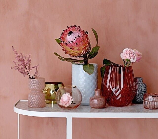
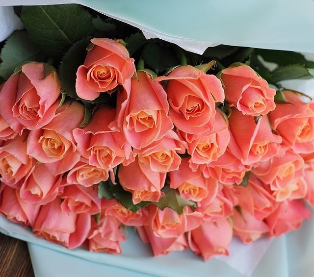
Corallicious!
After a few months, the situation is starting to become clearer. This was helped, among other things, by Pantone's decision on the colour of the year 2019. You know that since January, coral reigns supreme, right? :)
What else is buzzing in trends?
Or rather, making some noise:
vibrant colours
textured patterns
bold combinations
contrasting pairings
This year, we are also focusing on green. Not just in the form of leafy wallpapers and tablecloths, but also living plants in pots, vases, and mini-gardens on windowsills and balconies. And no, it's not just about monstera leaves!


Year of the Monkey?
In the Chinese calendar, 2019 is the Year of the Pig. However, according to the calendar of many interior design brands, in the coming months we can expect close encounters not with pigs, but with... monkeys. The monkey motif has made its way into collections from brands such as Bloomingville.


What the monkey tells us
At FormAdore, there's no talk of monkeys without at least a small mention of the famous Seletti Monkey Lamps – that is, lighting in the form of life-sized monkey figurines. Crucially, each lamp is fitted with an energy-efficient LED bulb. If you visited the Warsaw Home 2018 fair in October and stopped by the FormAdore stand, you undoubtedly spotted the Seletti monkey, which greeted all our guests :)


When design goes absolutely wild
Not keen on monkey business?
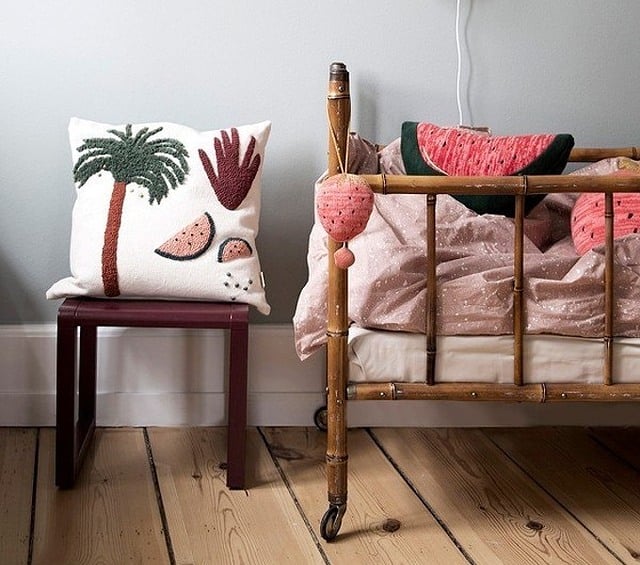
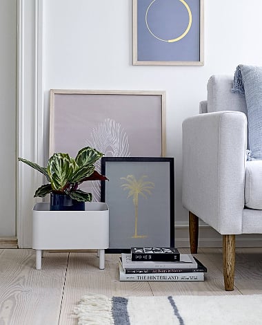
No worries, the monkey is just one element of a larger trend, a trend that embraces exotic vibes. Not long ago, monstera leaves were all the rage; now, design is going bananas... or rather, palm crazy. The motif of palms and their leaves can be found on
napkins and wallpapers
tablecloths rugs cushions
mugs jugs glasses
bedding vases bags
pots
containers
table runners
posters
plates
trays


Coral-coloured corals
When the Pantone Institute announced the colour of the year 2019, everyone breathed a sigh of relief. Unlike its predecessor from 2018 – the dark and unsettling Ultra Violet – vibrant, juicy coral quickly won the heart of the design world.
Living Coral seems made for interior decoration. It pairs beautifully with gold accessories (also trendy this season!) and greys; the latter can still be found everywhere, as the main theme of Scandinavian minimalism – a trend that has reigned for the past few years.
Vibrant coral is just the ticket to bring some life into a grey interior!


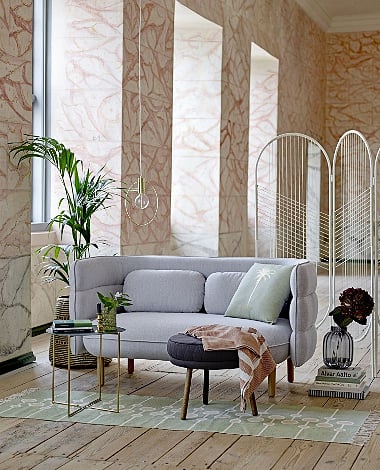
Art Déco – there's method in this madness!
Art Déco isn't as unruly as it might seem at first glance. Shiny, metallic colours, intricate patterns, and rich ornaments... extravagance? Not necessarily. Let's take another look to notice that diligent Queen Geometry reigns supreme over everything. In Art Déco, there's no room for accidental deviations or unnecessary madness.
This year, Art Déco is still holding court. In its golden version, it looks especially good alongside coral walls or furniture. Its geometric nature also means it will find its place in a stark Scandinavian interior.


A(nana)S up your sleeve
Pineapple! Are you familiar with this motif? Great, then we don't need to introduce it! And it's worth knowing, because it turns out that pineapple still reigns not only in exotic countries but also in living rooms (a bit further north).
Pineapple is a bit like the palm motif – one is fine, but you have to be careful not to let it multiply. A golden pineapple will playfully break up the somewhat baroque character of Art Déco, while at the same time enlivening Scandinavian minimalism. In 2019, the pineapple will conquer many an interior – you can bank on it.

Is that all?
There are many more trends for 2019. Regularly check our new arrivals section to know what's cooking. The above hodgepodge might have made your head spin a bit, but that's the charm of this year's trends – it's colourful, joyful, and bright.
Scandi is holding its own, but it's no longer the only player in the design arena. We hope this year will be exactly like the colour chosen for it, Living Coral – intriguing, cheerful, and far from boring.
FormAdore wishes you and... itself the same! :)